绘制柱状图
Python常用图表绘制
分组柱状图
又称聚合柱状图,在同一轴上显示各个分组下不同的分类数据。
假设我在一个名为all_result.xlsx文件中有如下数据:
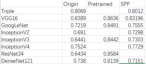
这是我训练模型的一组结果,左边一列是使用的模型,第二列是初始情况下的结果,第三列是采用了预训练模型之后的结果,第四列是添加了SPP结构后的结果。那么我想采用分组柱状图更好的显示结果:
-
读取xlsx文件中的数据
xlrd库目前最新版本不支持读取xlsx文件,于是我就使用了openpyxl库。
1
2
3
4
5
6
7
8
9
10
11
12
13
14
15
16
17
18
19
20
21
22
23
24
25
26
27
28
29
30
31
32
33
34
35
36
37
38
39
40
41
42
43
44
import openpyxl
def get_excel_data(excel_path):
excel_sheets = openpyxl.load_workbook(excel_path) # 获取工作表对象
accuracy_sheet = excel_sheets['accuracy'] # 获取工作表中名为'accuracy'的工作簿
print("行数", accuracy_sheet.max_row)
print("列数", accuracy_sheet.max_column)
label_list = [] # 存放第一行的不同实验条件
xlabel_list = [] # 存放不同的实验模型
origin_list, pretrained_list, spp_list = [], [], [] # 分别存放不同条件下的结果,与xlabel_list长度相同
for i, row in enumerate(accuracy_sheet.rows): # 依次遍历表格的每一行
if i == 0: # 将第一行的数据作为标签
for cell in row: # 遍历一行中的每一个单元格
if cell.value is not None: # 判断该单元格中的内容是否为空
label_list.append(cell.value) # 将内容加入到label_list中
else: # 依次遍历下面几行
for j, cell in enumerate(row):
if j == 0: # 如果是第一个单元格的话
xlabel_list.append(cell.value)
elif j == 1:
if cell.value is None:
origin_list.append(0.0)
else:
origin_list.append(float(cell.value))
elif j == 2:
if cell.value is None:
pretrained_list.append(0.0)
else:
pretrained_list.append(float(cell.value))
elif j == 3:
if cell.value is None:
spp_list.append(0.0)
else:
spp_list.append(float(cell.value))
print("不同的条件有:", label_list)
print("实验模型有:", xlabel_list)
print("origin条件下结果:", origin_list)
print("pretrained条件下结果:", pretrained_list)
print("spp条件下结果:", spp_list)
return label_list, xlabel_list, origin_list, pretrained_list, spp_list -
数据绘图
懒得采用matplotlib,直接使用了pandas库来进行绘图
1
2
3
4
5
6
7
8
label_list, xlabel_list, origin_list, pretrained_list, spp_list = get_excel_data(excel_path='all_result.xlsx')
# 将原来几个列表合并成pandas中的DataFrame格式
data_excel = pd.DataFrame(origin_list, columns=['origin'], index=xlabel_list)
data_excel = pd.concat([data_excel, pd.DataFrame(pretrained_list, columns=['pretrained'], index=xlabel_list)], axis=1)
data_excel = pd.concat([data_excel, pd.DataFrame(spp_list, columns=['spp'], index=xlabel_list)], axis=1)
print(data_excel)
data_excel.plot(kind='bar', style='--o', figsize=(20, 15), title="") # 绘制分组柱状图
plt.show()上述文件及代码可参考https://github.com/lover-520/lover-notes